Foreword: This is the first in a series of journals I’ll be posting about book covers, and how to make them. It is intended for the self-publishing writer with limited resources, but anyone who has any interest in creating covers can hopefully find some helpful info here.
For my part, I am a self-publishing writer, but I have the very substantial resource of being a professional artist as well. So although I have a bit of a leg up on the average writer, I am still left with creating my own covers, and my experience as an artist has given me some interesting viewpoints into the matter of cover illustration and design.
All the covers I’m using as examples come from traditionally published books I happen to have in my collection, and they are posted only for the sake of illustrating different types of covers. I have endeavored to provide all possible credit, and do not make any money from the posting of this journal. If you are the copyright holder of a cover, and feel your copyright is being infringed, please email me at goldeenogawa@gmail.com and I will remove your cover.
Making Covers: 1 — Introduction
For the self-publishing author, the cover of your book can be a real hurdle. Sure, you can write, but drawing is a completely different skill—and drawing a cover is a particular skill not all artists have. Witness some of the terrible professional covers out there.
No, creating a good cover is difficult no matter your skill set for the simple reason that it requires many skills. You need a piece of artwork—and it must be the right piece of artwork; you need to pick the right font; you need to know how to set that font; you need to get the colors and the contrast right. Most of all, you need a cover the matches your book. In the usual course of things, this process is shared by many people. In making your own cover you are taking on the jobs of at least two people: the artist and the designer. And that is perfectly okay.
The best covers, in my opinion, are those that are representative of the book itself. This may seem like an obvious priority, but think of how many books you’ve read that felt nothing like their cover. Don’t judge a book by its cover, the saying goes, and it’s a sad fact that it’s true. The feeling you get off the cover of a book, and the feeling you get from reading the book itself, and usually two very different things. And this is bad. Suppose you have a really exciting cover on a slow, thoughtful book? Well, the reader is going to get all excited, and then be disappointed when they find the book doesn’t live up to its exciting cover. But if you had a simple, elegant cover, evocative of the nature of the story, then the reader will come in better prepared, and probably like the book more.
This disconnect between the book and its cover is, I think, due to the reason that the book and the cover are made by different people who do not always speak to each other. The usual process, as far as I have heard, goes something like this: Author writes book. Sells to publisher. Publisher contracts artist, designer, to make cover. Maybe allows author some input on picking said artist/designer. Gets cover made. Maybe sends galley proofs to author if they are Stephen King or J.K. Rowling. But usually not. Book goes out.
This is a terrible way to make a cover for a book. Worse, some publishers will intentionally handicap their “B-List” with sub-standard, cheap covers. It’s terrible!
This is where being a self-published author actually has its advantages: You know your story, and since you are in charge of the cover, you have the power to make that cover be the best cover it can be for your book. Maybe it won’t win any art show prizes, but by golly, it will fit your book.
Problem: You are not an artist. You have no artist friends. You are too poor/do not want to spend the money to contract a professional artist to do the cover for you (which IS a viable option, but you must make sure you have a suitable contract hammered out and pay the artist what they’re worth). So what can you do?
This is where, I hope, I can help you. What I’m going to try to do with this journal and its sequels is walk you through your various options as a self-publishing writer with limited resources when it comes to making a cover. First, though, before I get to the step-by-step, I want to go over different kinds of book covers. Because even in choosing what kind of cover you have, you are influencing what the reader thinks of your book. It is paramount (and I will keep repeating this) to have a cover that accurately reflects the contents of your book. Oh, and you also want it to look visually appealing.
So, with these two priorities in mind, let’s look at some different types of covers.
First: Pure Text Covers

These are the simplest, and therefor both the hardest and easiest covers to get right. They are difficult because the entire weight of conveying a feeling for the book rests on the text, and so it is crucially important to get that right. However, they are also the easiest for someone who can’t draw to make, because there is no drawing necessary.
I say drawing to distinguish it from art. I will use art is its broadest term, meaning writing, drawing, and cover design. The latter of which is what pure text covers are all about: design. The design of a pure text cover is paramount, because there is all there is. So a few simple pointers:
- Large text is good: make it big enough to read even in thumbnail size, preferably.
- At the same time, don’t be afraid to make use of negative space to place emphasis on other parts of the cover.
- Take care when using light on dark text, because that is harder to read.
- Be utterly precise when it comes to your choice in fonts! Try to avoid free fonts unless you find one that is absolutely perfect. Don’t be afraid to drop a little money on a pro font; they are worth it!
- Using a split cover, like the example above, is a good way to keep a cover interesting without resorting to graphics. Consider contrasts of shade (light and dark) and hue (orange and teal) to split your cover.
But this is just a start. Later, I’ll have a whole journal dedicated to pure text covers, and how to make them.
Pure text covers work well for thoughtful, literary works. They are better for books aimed at mature audiences, I think, solely because adults will be more tolerant of a less-exciting cover. However, to the precocious reading ten-year-old, what’s in the book matters more than what’s on the cover, so don’t fret about using them for any kind of non-illustrated book.
Second: Text Covers with Decoration

This is pretty much the next step up from pure text covers. Basically, it’s pure text, but with a little decorative graphic to liven things up. Some covers are so discourteous as to use really beautiful drawings, but shrink them down horribly to make room for the author’s name. I dislike this incarnation of the text cover with decoration, so I shall not be covering how to make them.
Using a simple graphic, however, is a very good way of adding flavor to your cover. It can be an economical option for the author that can only commission a cheap piece of art. Professional artists are likely to charge far less for a little doodle of a bird or a cat than for a fully-fleshed out cover illustration. And the enterprising author can create their own decorations by going out a taking photographs of objects that are relevant to their story. Just be sure these objects are not in of themselves copyrighted works, or you could get into trouble!
The same concerns for choosing your font and text size apply to text with decoration covers as to pure-text covers. In fact, let’s just say right now: your choice in font is dreadfully important no matter what kind of cover you have.
Text with decoration covers are wonderfully versatile, and can be used for any sort of book.
Thirdly: The Illustrated Cover


This is where it gets really fun. Having a fully illustrated cover can be the best and worst thing that can happen to your book. Because if the illustration fits, it’s perfect and wonderful and adds life and dimension to your story. And if it doesn’t… well, at best it can be a source of bemusement for your readers. At worst it will mean you may not have as many, because some of them ran away in horror at the sight of it.
So be careful when choosing an illustrated cover. But again, as a self-publishing author you will have direct control and final say over what goes on the cover of your book, so this is not such a risk. The main inhibitor to a fully illustrated cover for the self-publishing author has got to be the price of the artist who makes the illustration. Now, this is a subject I have some personal experience with—from the artist’s point of view. But that really deserves it’s own entry, so it shall get one. For now let us pretend cost is no object: what are the different kinds of illustrated covers there are?
I can break these down into three broad categories:
1: Evocative illustrations, like the cover of Anathem, which are little more than a step up from text with decoration covers. Basically the illustration is there to support the text. It is background. But it’s still fun to look at.
2: Collage illustrations, like the hardback cover for To Say Nothing of the Dog. These are my least favorite; I find them jumbled and confusing and, in trying to represent many facets from the book, they end up giving an entirely false impression. Also, this particular kind of art style is powerfully difficult to do well. I don’t recommend it, even though it seems popular these days.
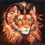
3: Good old cover paintings. This is where it’s at, for me, with fully illustrated covers. Get a real nice painting with good power and space for the author’s name and book title, and you’re set. Even better, as with Eight Days of Luke, get an artist who has clearly read the entire book and understands the importance of getting the characters to look right. This is absolutely the best kind of cover for a children’s book, but because you can pick an illustration that fits the story, you can use it for any book!
And there is one last kind of cover, though it isn’t really of much interest to the self-publishing author, because it is the Artbook Cover.

This cover is nearly the opposite of the pure text cover: it is all about the art. The title and author name have be shoved off to the sides and corners to make room for the art, which isn’t really a cover illustration at all: there is no good place in it for a title, or text. Any text would ruin the picture, in fact, because it is such a glorious picture. Artbook covers are all about the picture, as you would think since the books are generally about pictures.
But I am including it here because it provides a good example of what to do when your art doesn’t lend itself well to having text slapped all over it. Sometimes the best thing you can do with your title and you name is to get them out of the way of the art.
But it’s got to be some pretty fabulous art.
*
Coming up, I’ll be taking a closer look at the different kinds of book covers, and how to make them. I’ll also be looking at the process of commissioning an artist or, if you have some drawing skills of your own, how you can bend them to serve your illustrative needs.
Next, I’ll be going over the process of creating a pure text cover, using no graphics whatsoever.
Have feedback, comments? Email me at goldeenogawa@gmail.com, or tweet me the link to your own blog entry @GrimbyTweets.
—Goldeen